Posts

Police Headquarters

Image
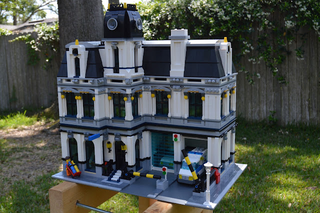
This is the Police Headquarters, a Lego building in the modular buildings style. It was designed and iterated digitally, then the pieces were ordered and the building was created in real life. 4,032 pieces were used in the construction.

Marianne

Image

Project 3

Image
natural , 2019 What is 'natural'? It is a vague term that means different things to many people- to some, meat is natural. To some, only eating plants is the only way to qualify as natural. In my short, I endeavor to question this dynamic in attitudes towards farming, food, and sustainability. I want viewers to come away thinking about their deep seated biases towards food and question why exactly they feel the way they do- is it because of a truly deeply held belief, or is it a gut reaction to something that someone else has shown them? The short does not aim to demonize one particular facet of consumption - this film is not anti-vegan, anti-GMO, or pro-factory farming. Rather, I want things like conspicuous consumption and branding of food, the dichotomizing of plants as food and meat as food, and even so far as the place of humans in the food chain to become questions in the forefront of the viewer's mind. I will know I have succeeded if even one person ...

Project 3 Rough Draft & Artist Statement

Image
Natural, 2019 We often question (or are led to question) whether our food is 'natural' or 'green' or 'healthy', all words loaded with meaning, yet functionally useless as real qualifiers of our food because of their proliferation by industry. In my short, I humorously try to use surrealism and match cuts to question our relationship with our food and the qualifiers we give it. What makes a pepper more 'natural' than bacon? Is a tomato really more 'healthy' than beef? What is more 'green'- the farm raised pig, or the corporate farmed tomato, or the factory farmed cow, or the locally grown pepper? Many of these questions have no firm answers, yet there are many people who vehemently defend their position or stance. I aim to call attention to these questions through humor and surrealism.

Project 3 Brianstorming

Image
The whole idea behind avant garde is defying expectation to create something bizarre and inscrutable, right? What could be more inscrutable than the mundane? There's a lot of nuance to our everyday actions and the way they are depicted on film, and I think it opens a lot of space for making small changes that can be easily passed off as real, but ultimately convey a sense of the fantastical, or of dread, or of just plain confusion. Perhaps I am cooking something, but the item on the stovetop is very much so not food. I'm not entirely certain of the direction I want to take this yet, but I am trying to hone in on a particular avenue of focus and I think that cooking may well be that avenue.

In-class Premiere Pro exercise

Image

Project 2 Critique feedback

I enjoyed all the feedback I got! I'm very glad people responded well to my somewhat silly topic choice to propagandize for. Some of the critique I would definitely take action on if I were to go back and work more on the piece (particularly the flowers; a larger size for better readability at a distance is something that I more or less knew but didn't feel like going through the process of doing!), but on some other critiques I'd play the artist card (I was and still am particularly enamoured with the color and layout I went with on the "ROUNDABOUTS" text on the upper portion- I went through a bunch of different layouts for it and ultimately the one I went with was the one that clicked for me once I played with it. And that's the guiding principle on a lot of my choices in my art!). All in all, I'm extra happy with the fact that there was no major substantive criticism of my piece- that makes me feel that I did a good job in conveying my message and that ...

ROUNDABOUTS

Image
Roundabouts, 2019 Roundabouts are a traffic solution that I feel are misunderstood at best and actively campaigned against at worst. They are a superior intersection solution to stoplights or stop signs in many  intersections and through my art I sought to propagandize for the proliferation of more roundabouts into the urban landscape. They are more efficient than traffic lights and lead to less idling cars and traffic, which means fewer headaches and less pollution for the world. Roundabouts seeks to convince through a divided narrative of a lowered version of the current world, dark and smoggy, and a clean, sunny interpretation of what the world could be, if only the viewer were to take action! 

Project 2 Rough Draft

Image

Tracing paper

Image

Illustrator and the Three Bears

Image
(from left) Happy, Sleepy, Bartholomew

Typography Playground

Image

Skull

Image
It feels like it could be for an off-brand sports team, no?

Propaganda Brainstorming

I'm generally interested in current day political issues, design in the everyday world and where it could be improved, music, urban planning/architecture, and a multitude of other things (cop-out, I know!). I'd say some of my core beliefs are fairness, reliability, an experience-oriented life, a spirit of adventure, curiosity, openness, rationality, efficiency, respect, and loyalty. Something somewhat silly I feel passionate about are roundabouts- I feel like they would solve so many efficiency problems in the US if only we would be more open to them in concept and execution. On a more serious note, I also feel passionately against guns and the proliferation of them in American culture- it's yet again an efficiency and protection for those who are vulnerable to make common sense reforms to gun laws in the US, but the desires of the few somehow continue to overwhelm the concerns of the many. Something that may also work is my feelings towards horoscopes and birth signs- I fe...
Color Brainstorming

Image
When I think of propaganda, and successful propaganda, my immediate thought is the work of the soviet union, like this: It makes use primarily of red to draw your eyes initially to the image of Russia, and eventually to the the bow on Lenin's lapel. The image is highly active, with strong action lines in Lenin's arm and the worker holding the torch, along with the motion lines coming out from the star (which generally lead backwards, conveying the message of moving forwards). Obviously Soviet Propaganda was successful in that it is not only remembered today, but also informs how modern propaganda is made. It does this through clear, concise messages that are brief in order to be quickly read and viewed on the go and understood with a quick glance. Striking colors (though typically limited) make the entire image a focal point, and the viewer's attention is then directed to the propagandizer's targets through uses of the main color as an accent.  A more modern ...

Critique retrospective

Going into this critique, I was cautiously excited to show off my work and see where everyone else had been with theirs. As we approached the 9pm deadline and there were multiple people still queued up to show their work, I became nervous that I wouldn't make it up and instead of feeling relieved as I normally do when a deadline is pushed back, I was...tense. I take that as a sign that I was truly proud of my work and ready to show it off. So when a week later came and I got my time in the spotlight, I was so happy with the feedback I got! I had some concepts in my work that I was worried wouldn't come through or had been too obfuscated for people to pick up on. Instead, almost every concept I tried to communicate was picked up on by the audience and I couldn't have been happier! There were even interpretations of my art that I didn't intend, which I loved as well. All in all it was a great experience and I hope to use the feedback I received to carry my art forward i...

Project 1

Image
Between the Mirrors, 2019 Between the Mirrors  is an examination of the self in the age of digitized personas and the identity as formed by consumption and not creation. It uses the digital nature of photoshop to subvert and play with the expectations of the selfie and the idea of what is real, what is imagined, and where we stand in the between. I sought to distill that feeling of being in between worlds; in between artificial contentment and the pitfalls of reality through the visual metaphor of mirrors. Outside the box I have been placed in lie distorted visions of self-fulfillment and social adoration, yet my physical self is restrained like Tantalus, able only to view these twisted versions of reality through the lens of my phone, which is the only thing able to move between the artificial and real worlds. Meanwhile reflected in the virtual mirror is my self, dissected into the checkmarks and quantifiers that represent my digital identity.

Self Portrait Rough Draft

Image
Artist's Statement: In its current form, this self portrait is part vomit of distilled personality traits, and part unrefined ideas of my greater id, ego, and superego. I wanted to establish a sense of dichotomy between aspects of the image- separating the faceless head with its chart brut style of representation from the more subtle 'fig' leaf and heart in my hand; separating the image between the mirrors from the mirror worlds of unrealistic, filtered happiness, with the cutout phone being the perceived key and link between the two.

Just Peachy 🍑

Image
Original:

TFW you get left home alone

Image
  Kevin McAlister à la the Mr. Krabs meme