Color Brainstorming
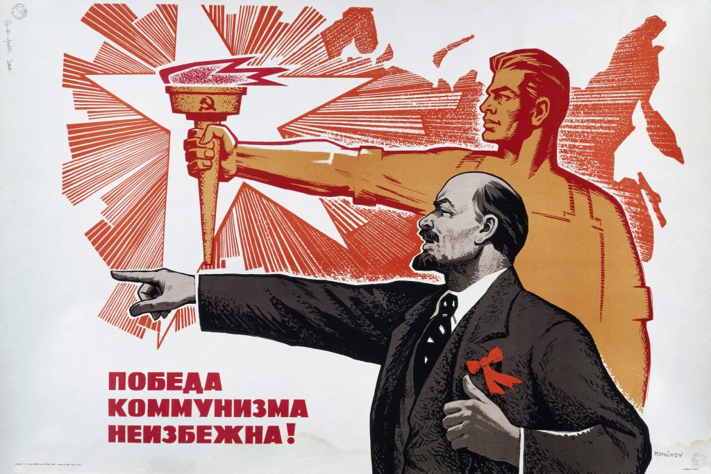
When I think of propaganda, and successful propaganda, my immediate thought is the work of the soviet union, like this:
:no_upscale()/cdn.vox-cdn.com/uploads/chorus_asset/file/10815907/russian_troll_ads.jpg)
It makes use primarily of red to draw your eyes initially to the image of Russia, and eventually to the the bow on Lenin's lapel. The image is highly active, with strong action lines in Lenin's arm and the worker holding the torch, along with the motion lines coming out from the star (which generally lead backwards, conveying the message of moving forwards). Obviously Soviet Propaganda was successful in that it is not only remembered today, but also informs how modern propaganda is made. It does this through clear, concise messages that are brief in order to be quickly read and viewed on the go and understood with a quick glance. Striking colors (though typically limited) make the entire image a focal point, and the viewer's attention is then directed to the propagandizer's targets through uses of the main color as an accent.
A more modern example is the ads that Russian operatives put on Facebook to try and sway the 2016 presidential election:
Yet again, singular colors against mostly monochromatic backgrounds are used to draw attention (see Don't Shoot, Blacktivist, Stand Against, and the one from the Afrokingdom page). There are other examples that use Trump's visage as the focus, though they aren't as effective in my opinion. For example, in the Being Patriotic image, they had to give Trump a halo effect to outline him as the focus of the image. So using natural points of contrast along with small alterations to desaturate a background while saturating the foreground is useful to draw the eye and focus the viewer's attention on the propaganda.
Using colors that typically signal danger (reds, yellows) helps to draw the eye to the propaganda. Then the artist can use a combination of saturated and monochromatic areas to direct attention around the image as the initial draw of the splash of color goes away. Less alarming colors (blues, greens) can be used to present a less alarming point, or to present one in a less aggressive stance. But color should be used to draw the viewer into the work with strong, saturated colors, and then, once their attention has been grabbed, manipulate their emotions by the color balance and positioning of contrasting colors.
Bonus: The video can be problematic because it is generally reductive in its observation of color. While the concepts in the video are appropriate and known, the video holds them as absolutes while almost every example cited goes against the grain in some way, shape, or form.

Comments
Post a Comment